|
DESIGN is one
of the most important aspects on a website, with ease of use and
how pleasant to the eye colours are being able to make or break
a site. Experience has shown that people expect main navigation
features to be along the left or top, and easily identifiable.
Another major
concern is the time that it takes to download a site, with users
being put off using sites or revisiting them if pages are not rendered
in a reasonable amount of time.
The following are a number of example screens designed to be usable
and functional, colours and effects can be added to comply with
a corporate image, and designs can be made to any specification..
 |
Squares
|
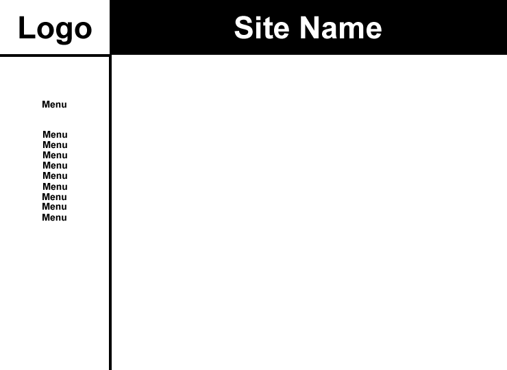
A
sharp blocked design, space at the top left for the logo or
site name and an area for a banner advert or the site name in
top. A simple text based menu on the left hand side, that could
include a Java script expanding menu.
Plenty of room in the middle of the page for text and graphics. |
|
Curves
|
 |
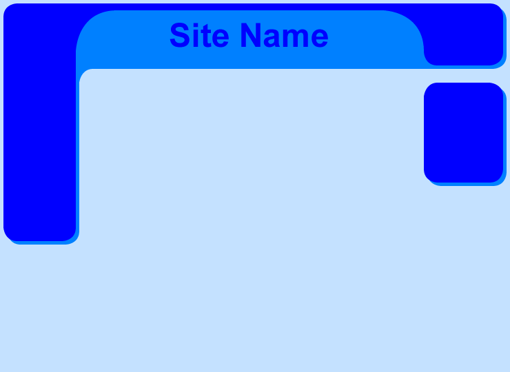
| Two
part circles joined together to give a move organic look, plenty
of space in the middle for content and areas for site names
and logos. A blocked menu system to allow easy navigation and
expansion for extra options. |
 |
Inverse
|
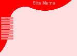
| A
wrapper effect allows plenty of menu options available on the
screen at one time, spaces for a banner ad and logos, more restricted
space in the centre, suitable for a catalogue with small pictures
and tables. |
|
TopBot
|
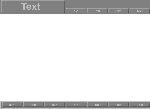 |
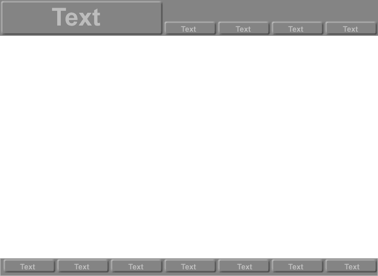
| Navigation
split on the top on bottom, good for the drop down menu effect,
with the bottom menu best used for replicating the top level
menu items. Plenty of space in the middle for text and graphics. |
| Other
demonstration designs are BarAndCurve,
Small Circle,
Bars and Blocks. |
|
